Introduction
Karen Bassett, Co-Founder and CEO of Wayfarer Coffee Roasters, has had the dream of expanding the cafe she was running into a full fledged weekend coffee festival. Having already known Karen and been working with her on the cafe’s branding she approached me and asked for my help in developing the visual identity of this new festival. In the New England Coffee Festival’s (NECF) first year we surpassed our targeted attendance of 3,000 by over 2,000.
The Story of Wayfarer Coffee Roasters
Wayfarer opened its doors back in 2015 in the heart of Laconia, New Hampshire. Beating the odds of a town known to be tough for new businesses the cafe has only grown in size and scope! In 2020 amid a global pandemic, they opened a second location, and a year after that they expanded their flagship location to include a marketplace. Karen had another dream however, to bring a serious coffee festival that attracted both coffee industry professionals and casual coffee enthusiasts into town!
The Mountain of Work Ahead
Knowing that a festival requires not only a lot of planning and structure on the backend, but also a lot of visuals to cue the festival attendees, Karen and the team at Wayfarer asked if I would be up to the task of designing the visual identity of the newly formed NECF. This was no easy task, and without the help of someone knowledgeable in design principles, software and project management would have been nearly impossible.
How I Responded 
Eager for a new challenge, I got started right away with only an illustration and a basic type logo to start with. The direction that Wayfarer had in mind was to give the festival an air of elegance, without feeling too unapproachable for the average coffee consumer. A tall order, but I was ready to deliver.
NECF Logos
The logo needed to be versatile and memorable, in line with the goals of the brand. The three basic iterations are found below and can be seen used and stylized in many formats throughout this study.

The main logo with an alternating white and mint color scheme to give contrast.

The alternative abbreviated logo to be used in tight spaces, on web and in social.

The last iteration of the logo only used in spaces that are long and narrow where neither the main or first alternate logo does not fit.

The Sponsor Brochure
The very first asset that needed to be designed turned out to be the piece that laid the basis for the rest of the brand: the sponsor brochure.

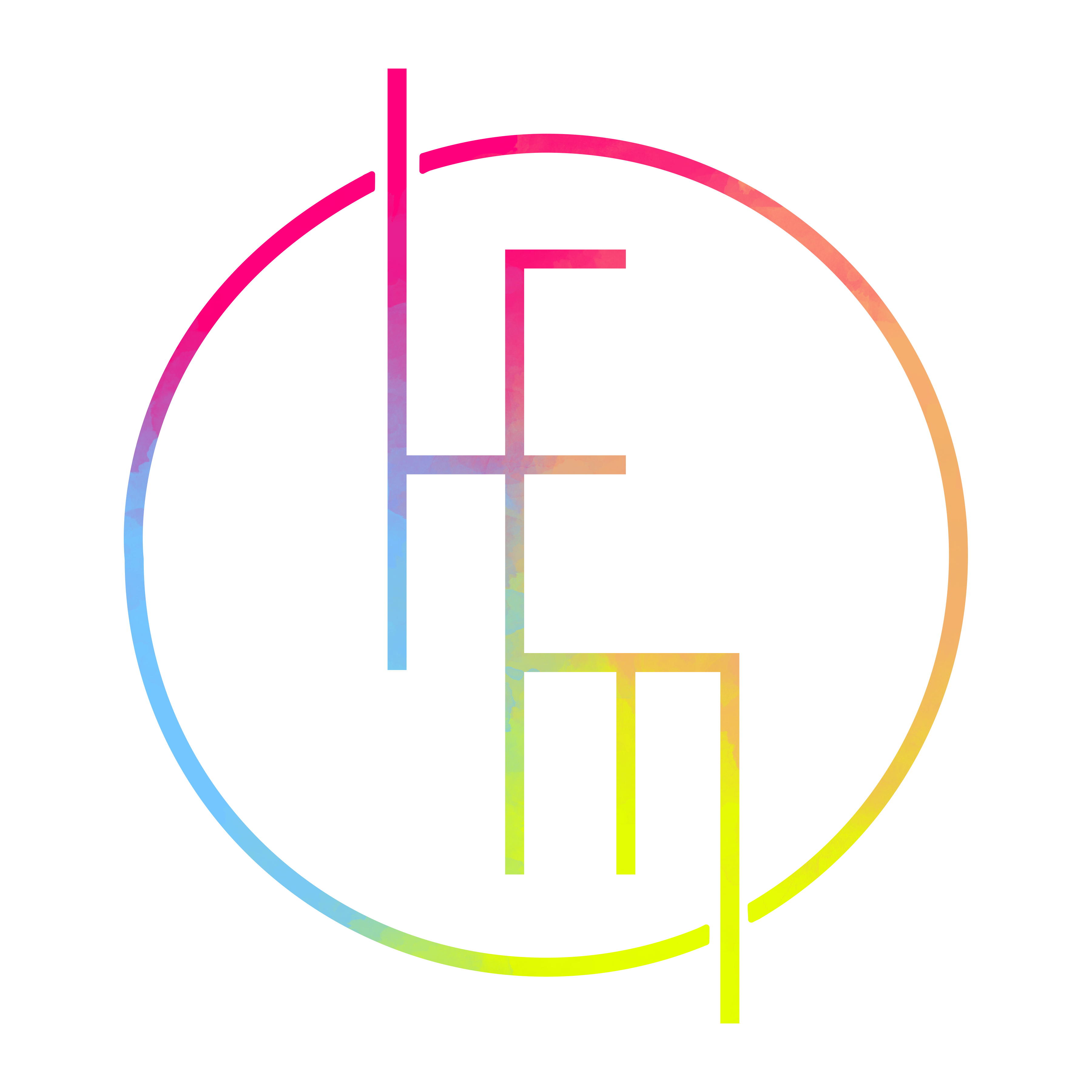
The illustration used on the cover along with a basic type logo were the only assets given to me to create the brand out of. The illustration has become the mascot of the first year of the festival!

This page of the brochure is what shaped the aesthetics for the rest of the festival! With a soft glow being added to certain elements, white accent against a dark chocolate background and a contrast between outlining text and filled in text to differentiate titles.

The NECF Festival Magazine
A huge undertaking for the sole designer of a new festival is designing and developing a full spread magazine from scratch. This is the result of many hours of labor, layout decisions and changes, creative direction and frequent content updates.
Social Media Aesthetic
Being a new festival it is vital to be active on social media to hype up the new event and keep all of its followers informed. This is a sampling of the templates and assets I created to support festival marketing.
NECF Merchandise
Merchandise is highly anticipated and expected at any festival, all of the offerings had to match the aesthetic and the values the NECF was offering!
Supporting Design Elements
There are so many details that make an event run smoothly and be a success. Here are a few essentials to inform the audience and improve their experience during the festival.

A city wide map with the festival areas highlighted with their respective color codes.

This is one of the 10' 4 sided displays that act as information centers placed around the main areas of the festival.

The Latte Art Throw down was the climax of the festival, with posters all throughout town to promote the last event!

An example of the 8' feather banners used to highlight the entrances to key event areas.

Back to Top